08 May 2022
Aesthetic-Usability Effect
“Beauty over function.”
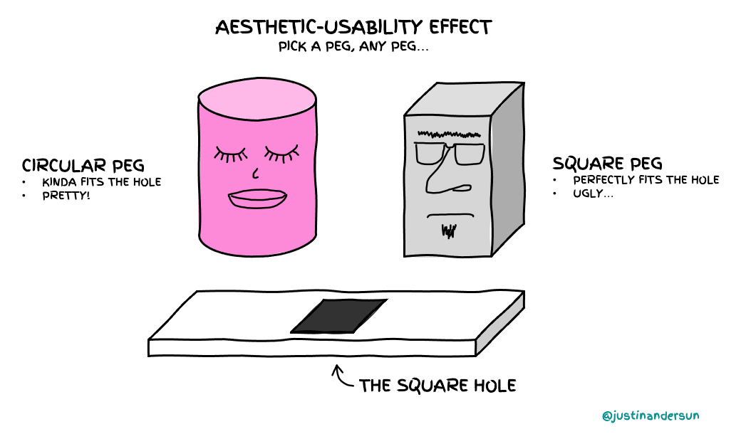
In 1995, researchers at the Hitachi Design Center studied the “aesthetic-usability effect” with an ATM. A less usable but good-looking ATM interface beat easier-to-use UIs with poor aesthetics. The researchers found that a positive emotional response from visual design makes the user more tolerant of issues—such as software bugs, poor latency, or missing features. Pleasing aesthetics can be a literal mask for product problems.
Beauty creates a halo, making people believe that the product is high-quality. We perceive pretty people as smarter, funnier, and all-around better. An attractive person can charm us into overlooking mistakes or social fumbles.

Takeaways:
- Keep the design basic when you want genuine feedback on the function or content of something (i.e., a piece of writing, an app).
- Spend time on aesthetics if you want to improve adoption. The positive emotions elicited from your audience could be the “tipping factor” (i.e., a recruiter selects your resume because it looks better than others).